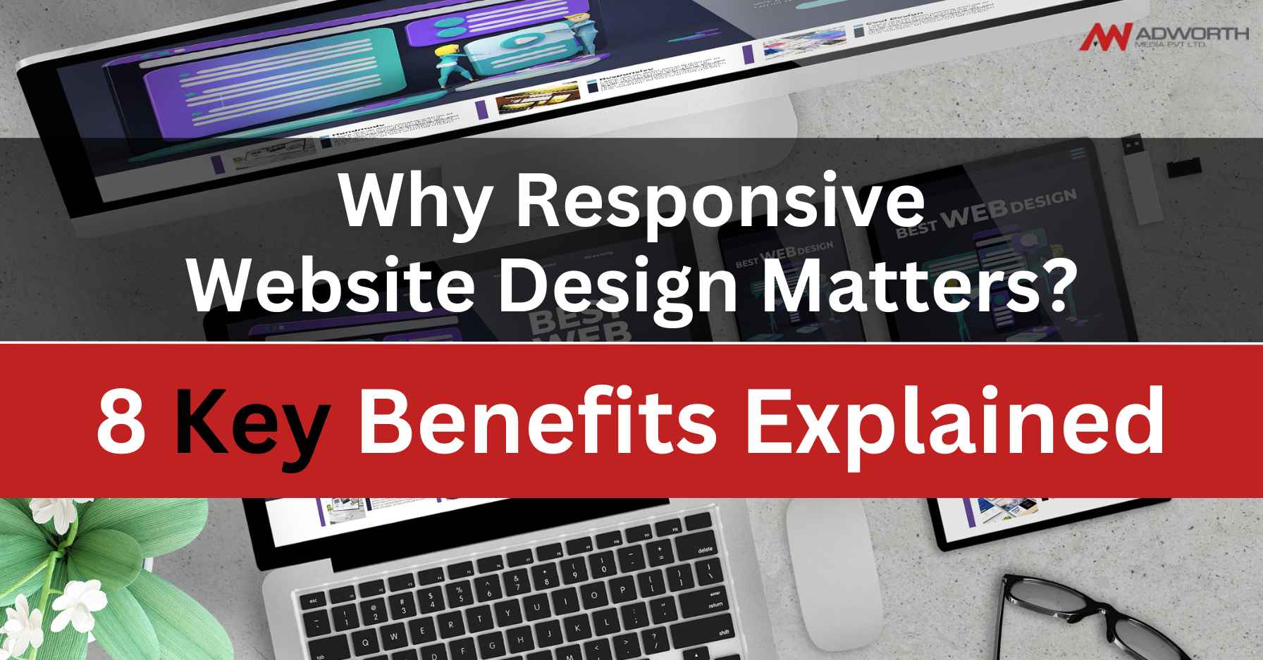
Why Responsive Website Design Matters?
In today’s digital world, having a website that looks good and works well on all devices is super important. That’s where responsive website design comes in. So, let’s dive into why having a responsive website is such a big deal and how it can benefit you!
Better User Experience:

Imagine trying to view a website on your phone, and you have to pinch and zoom just to read the text or click on a button. Not fun, right? With responsive design, your website adjusts automatically to fit any screen size, making it easy for visitors to navigate and find what they need.
Increased Mobile Traffic:

More and more people are using their smartphones and tablets to browse the internet. A responsive website ensures that you don’t miss out on this mobile traffic. No matter what device your visitors are using, they’ll have a great experience on your site.
Improved Search Engine Rankings:

Search engines like Google love responsive websites because they provide a better user experience. When your site is mobile-friendly, Google is more likely to rank it higher in search results, which means more visibility and traffic for you!
Faster Loading Times:

Have you ever visited a website that takes forever to load on your phone? It’s frustrating, right? Responsive design helps to optimize your site for speed, so your pages load quickly, keeping visitors happy and engaged.
Lower Bounce Rates:
When your website looks good and works well on all devices, visitors are more likely to stick around and explore. A responsive design reduces bounce rates by providing a seamless experience across desktops, laptops, smartphones, and tablets.
Higher Conversion Rates:
A user-friendly website is more likely to convert visitors into customers. With responsive design, it’s easy for people to find what they’re looking for and take action, whether it’s making a purchase, filling out a form, or contacting you.
Cost-Effectiveness:
Instead of creating separate websites for desktop and mobile users, responsive design allows you to maintain a single site that adapts to different devices. This saves you time and money on development and maintenance in the long run.
Future-Proofing Your Website:
Technology is always changing, and responsive design ensures that your website stays relevant and accessible in the future. By investing in responsive design now, you’re setting your site up for success in the long term.
In a nutshell, responsive website design is all about providing the best possible experience for your visitors, no matter how they access your site. It’s good for users, good for search engines, and good for your business. So, if you haven’t already, it’s time to make your website responsive and reap the benefits!